Get Ready for Product Page Optimization: iOS 15 A/B Testing
In June 2021, Apple announced a new App Store Connect functionality that has been long-awaited by App Store Optimization practitioners: product page optimization, a new feature allowing app developers to conduct creative A/B testing directly in the App Store. Though the functionality was not released directly with iOS 15 and is only expected to come out “later this year”, we have gathered the most important information and advice to help you get ready to start running tests on day 1.
What will product page optimization look like?

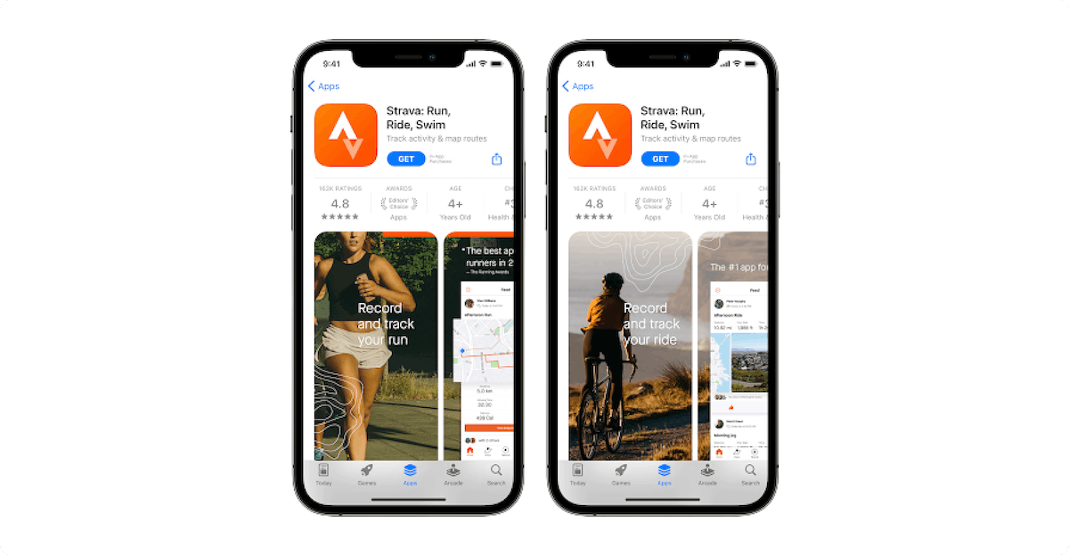
Product Page Optimization preview shown during WWDC 2021. Source: developer.apple.com
According to Apple’s announcements at WWDC 2021, product page optimization will allow marketers to compare up to three variants with the original product page. Marketers will only be able to submit creatives (icons, screenshots, and app previews) for tests running up to 90 days either globally or in specific locales. In addition, while all tested assets will need to be reviewed by Apple, developers will be able to submit screenshots and app previews they want to test independent of submitting their entire app for review (test icons will still have to be submitted with a new app binary).
As for piloting tests and overviewing results, Apple confirmed developers will be able to run global or local tests but have not yet disclosed how statistical significance will be determined or what breakdown of traffic driven to each variant will be available.
Which product page optimization tests should you run first?
Although we have yet to see the specifics behind Apple’s new A/B testing tool, a major question is what elements marketers should prepare to test first. As often in ASO, there is no one answer for everyone, but here are some tips to help you plan your testing backlog:
1. Prioritize tests based on the strength of your hypotheses
Coming up with creative hypotheses is as much a challenge of looking inward – assessing which elements of your product or brand matter most to your existing users – as outward – comparing your assets with competitors’ and best practices to identify specific user expectations or ways to stand out. Prioritizing which tests to run first, however, has a much more “inwards” focus as the value of a hypothesis is based on the impact a result may have. It is especially important to consider here that a test’s value should be based on what may be learned from the outcome, and not only the expected impact on a specific KPI (a great result you can’t explain is hardly scalable).
Therefore, remember to validate the real hypothesis behind a new asset by asking how it could affect the user and/or which stakeholders may benefit from the test results. For instance, testing a new background color can be either trivial or significant depending on why the new color is being tested (e.g. to measure if users have a color preference or to improve the legibility of elements on your asset).
Finally, a good way to ensure a test is worth putting at the top of your backlog is to ask someone on your team to compare the old and new assets while you measure how fast they identify what was changed and evaluate how easily they are able to explain why the change is being tested.
2. Test assets based on differences in user experience
An important consideration for A/B testing creatives on iOS also regards the necessity to test different assets than on Google Play. In recent years, despite many ASO practitioners highlighting the differences between iOS and Android users, we have observed that most apps and games use the same creatives (with minor adjustments) on both stores. This behavior was often explained by the need for apps to scale their creative efforts, and very little challenged since no iOS A/B testing tool was available to try and concretely measure the supposed differences between operating softwares.
Inversely, apps that did display different creatives on the App Store and Play Store were assumed to have measured differences in user behaviors through some internal product metrics justifying their choice of different assets. While this may not have always been true, it would at least mean there is no simple answer as to whether iOS and Android users are different, but rather that each app should look to its internal metric to determine its own answer.
Nevertheless, one consideration that should impact your testing process and the hypotheses you prioritize is that all App Store users interact with a different user interface (UI) to Play Store users:
- The UI for Play Store search results only shows each app’s icon, title, rating, size, and Google tags, with users having to open an app’s store listing page to download the app. On the other hand, App Store search results prominently show the first three portrait assets (or the first landscape asset) in the app’s creative gallery (consisting of the app preview video and screenshots), and also give users the opportunity to download the app immediately.
- Meanwhile, the store listing UI on Google Play is very different from app product pages on the App Store:
- Play Store listings usually show three to four portrait assets (or one to one and a half landscape assets) based on a specific height ratio which limits the size of the creative gallery to about 20% of the screen. Contrarily, only about one and a half portrait assets – or one landscape asset – is displayed on the App Store product page and takes up nearly 50% of the screen.
- Videos on the Play Store are always in landscape orientation and do not necessarily autoplay, instead sometimes requiring users to tap on the feature graphic. On the other hand, videos on the App Store can be either in landscape or portrait format and autoplay seamlessly, making the poster frame much less prominent in comparison.
These UI differences are therefore likely to impact how users perceive the same creative concept if duplicated on both stores instead of being adapted per platform. As a result, you may consider testing different versions of the same initial concept per store to better understand whether users react to the same value proposition.
3. Account for design & review times to plan for your iOS tests
Last but not least, do not forget to consider how much time a design team may need to craft specific assets for your upcoming tests as well as the fact that your creatives can only be tested once they have been reviewed by Apple. Remember – app icons can still only be changed via an app binary upload which will force you to program your app icon tests after a new app submission. The good news is that screenshot and app preview video tests won’t require an app binary submission; nevertheless, all assets will have to undergo Apple’s asset review process to ensure they do not contravene App Store guidelines. This will directly impact how realistic your testing schedule will be and may hinder efforts to test time-specific assets which may have to be implemented directly without testing.
In conclusion, despite certain unknowns, developers should start preparing to A/B test assets on the App Store by:
- Confirming which hypotheses match internal team priorities
- Ensuring future creative assets can fit the App Store user interface
- Accounting for time needed for test assets to be designed and reviewed by Apple
Discover how AppTweak can help boost your creative optimization strategy with upcoming changes on iOS 15.

